Why So Many Fast Food Chains Have Red And Yellow Logos, According To Science
It's no secret that companies use psychology to influence potential customers. This takes many forms. In Las Vegas, for example, casinos are intentionally designed to be disorienting, thereby subtly encouraging visitors to stay in the labyrinth and continue gambling. Anyone who's wandered through Vegas will have surely noticed the maze-like designs, but there are even more attempts at manipulating our mental states than that.
It's become increasingly apparent, for example that social media is specifically designed to affect our brain in certain ways, mostly by doing whatever it can to maintain our attention with small but consistent dopamine hits. Meanwhile, restaurants are using science hacks to make us hungrier, and this goes beyond the rise of "scent marketing," which involves fast food chains pumping out the smell of their food in order to attract would-be customers who happen to be passing by.
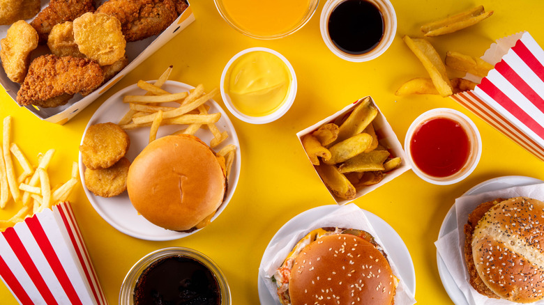
You might have also have noticed that a large majority of fast food chains use red and yellow in their logos. Why? Well, it's a striking color combination designed to attract attention, but there might just be a little more to it than that. In fact, research suggests that this particular color combination might come with some subtle psychological effects.
Color has an effect on mood
These days fast food restaurants seem to be much less colorful than they once were. There's no shortage of memes doing the rounds which compare McDonald's restaurants of the 90s, with their colorful architecture, to the bland colorless blocks that stand in their place today. But you'll likely never see these restaurants abandon color altogether, especially in their logos. That's because colors have long been thought to contribute to our mood and even have an influence on our appetite.
Color and light don't just provide us with a way to visually interpret the world around us. There is something called a non-image-forming visual pathway which refers to the way in which certain retinal ganglion cells send signals not to our visual cortex, but to the area of our brains known as the hypothalamus, which forms part of the limbic system structure. Rather than forming visual images in our minds, this part of our brain controls the secretion of hormones and is the key area involved in how our brain processes food, which essentially means that color and light can have an observable affect on our mood.
Whether color can therefore affect our appetite, however, is not entirely clear, at least in terms of the research. Still, with all this in mind, it's not surprising that marketers use color to try to influence our feelings about their products, and fast food chains are no different in that regard.
Red might not be as effective at stimulating our appetite as thought
Yellow might be less common, but many fast food chains have red in their logo, and it's not entirely clear whether this goes beyond the fact that this particular color is eye-catching. In a study published in the Journal of Education, Humanities, and Social Sciences, researchers divided the color spectrum into two groups: warm and cold. They then conducted a survey using images of staple foods and desserts with different color filters. The results suggested that people preferred staple foods and desserts with warm filters overall. (cold-filtered desserts, however, were unsurprisingly more popular than cold-filtered staple meals). As such, you might start to think that warmer colors have a direct impact on our appetites, but things aren't quite as simple as that.
Red is often said to increase our appetites, but there is a lack of studies to back up this claim, and what findings there are have been inconsistent. A study published in Frontiers in Psychology, for example, involved asking 448 individuals to look at images with differently colored sweet foods and concluded that red and blue coloring didn't have any of the effects on appetite that the researchers expected.
What we do know is that red is a stimulating color in other ways. A 2015 study in Color Research and Application showed that heart rates among university students increased in the presence of red and yellow, while blue increased relaxation and calmness. These results have been confirmed by other researchers, but the overall effect has been small. So, are fast food chains trying to influence our appetites with their use of red and yellow or not?
Fast food restaurants likely use red and yellow to catch your eye
If fast food chains are relying on red and yellow to increase their customers' appetite, it might not be the most reliable approach. A 2012 study published in the journal Appetite actually tested whether participants drank less from a red cup than a blue cup or ate less snack food from a red plate than from a blue or white plate. The researchers concluded that red functioned as a stop signal, and actually reduced food and drink intake, there's no reason to think that red is used in fast food logos to increase appetite. That said, a 2006 study published in Management Decision detailed how people make decisions within 90 seconds of their first interactions with people or products, and that between 62%–90% of that decision is based on colors. The study concluded that colors can actually be used to increase or decrease appetite as well as enhance mood, help customers relax, and even change people's perception of how long they've been waiting, although that doesn't prove that all fast food restaurants use red for this specific purpose.
Another explanation for fast food logos reliably using red is that the color simply became synonymous with fast food businesses over the decades and naturally became widespread. What's more, marketers such as Karen Haller, who runs a behavioral design consultancy, point out that red is a stimulating color capable of eliciting feelings of excitement while yellow conjures feelings of happiness and friendliness. This is a much more likely explanation for the use of red and yellow in fast food logos, and in a more general sense, red's use in logos generally.
As neuroscientist and National Eye Institute artist Bevil Conway told Reader's Digest, "There's an incentive to make logos red because red is the most visible color." Conway goes on to explain, "There's overwhelming evidence that red is a special color. Of all of the colors, around the world, in all of the world's languages, we communicate red most efficiently." Still, even Carter repeats the claim that the color red is said to stimulate appetite, but this isn't necessarily backed up by science.