America's New Geological Map Can Tell You Lots About The Ground You Live On
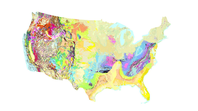
In August, the United States Geological Survey (USGS) released its most extensive geological map to date. It's called The Cooperative National Geologic Map, and it provides an interactive look at the geological makeup of the lower 48 states in unprecedented detail. The project is part of the USGS's National Geologic Map Database program, which provides publicly-accessible archives of US geological survey data. Now, the data has been compiled into a clean, interactive map, making it much more comprehensible for anyone interested in the geological makeup of the land they live on.
Previously, such compilation maps required years of meticulous work, while new discoveries and ongoing surveys often rendered a project outdated by the time it finished. Furthermore, those drawing information from the National Geologic Map Database (NGMDB) often had to convert between different units and naming conventions, since local surveys weren't standardized. But The Cooperative National Geologic Map has caught up with the times. Using software to synthesize incoming data, the project can analyze and compile new data sets to quickly update the map. Currently, over 100 smaller maps from over 27,000 records have been stitched together to create the new national map without the disparities.
The result is an eye-catching map of the lower 48 states, providing an easy-access resource for students, researchers, and any other interested parties. But geology is more than just finding neat rocks. Accurate geological surveys are critical for public safety; geological data is used to assess earthquake risks, plan infrastructure, monitor groundwater, identify ground stability, discover hazards, and much more. And now that non-professionals have easy access to such data, communities are better empowered to double-check the work of geologists, ensuring that each new bridge, pipeline, or fracking project, for example, is safe for the people that live there.
How to use the Cooperative National Geologic Map
After opening the The Cooperative National Geologic Map in a web browser, you can immediately start navigating it, much as you would explore other free satellite maps of the planet like Google Earth. Zooming in shrinks the scale, clicking on a specific area will drop a waypoint marker, typing in the search bar allows for quickly locating a town, county, or landmark, etc. You can also select different overlays: topography, hillside bases, or satellite bases.
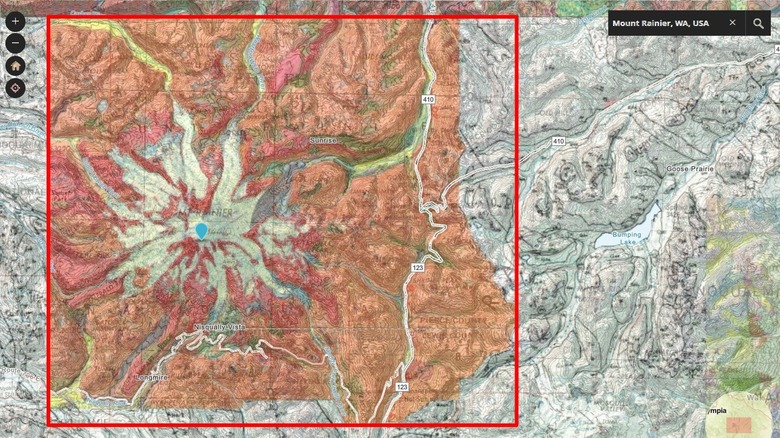
The color key of The Cooperative National Geologic map is the same as that used by records in the National Geologic Map Database, which distinguishes geological layers by composition and age. For instance, bedrock appears grey while stabilized dune sand appears yellow-green. The color key also groups these colors by geological epochs. Metamorphic blocky colluvium, for example, is marked by an amber color, indicating that it formed during our current epoch, the Holocene.
Once you've honed in on a specific area that you'd like to explore, you can employ the map's greatest trick. On the left-hand panel, direct links to every geological survey report used to generate that specific zone of the map are listed for access. For instance, if you click on Mount Rainier, one of the country's largest active volcanoes and part of the rumbling Ring of Fire, the interface provides direct links to the 25 geological records from the National Geologic Map Database that were used in the mapping, ranging from recent reports from 2025 to surveys dating back to the 1800s. One colorful survey from 1964 displays the layered cross-section view of the mountain — letting prospectors know, at the very least, that the 14,000-foot volcano isn't a viable spot for a mining.